If you run paid ads, it’s tempting to blame “lead quality” on the form. Too many fields. Not enough fields. Wrong questions. Bad follow-up.
By the time someone clicks, they have already answered three questions in their head:
- Do I trust this?
- Do I feel safe?
- Is it worth my time?
Okay, so they don’t consciously sit there and think those exact sentences. But their brain and nervous system do the scan, without even realising it. And that scan happens before the click, and it determines exactly how the opportunity will unfold.
If the ad hasn’t built trust, the form can’t fix it, and in a world where AI is more deeply involved in advertising than ever, you have to work smarter.
If the ad has built trust, the form’s job becomes as easy as filling in some info.
Why this matters more than you think
LinkedIn says its Lead Gen Forms average a 13% conversion rate, compared with 4.02% for landing pages (citing an Unbounce study). The lead generation form on LinkedIn also comes with an added benefit that it can autofill the fields using your profile data, making it as easy to send as saying “oh alright then”.
That gap is not only “forms are easier”. It’s also trust and expectation. On-platform forms feel familiar, and users have a clear sense of what happens next.

Unbounce also reports a broader median landing page conversion rate of around 6.6% across industries (based on a large dataset).
The point is not which number is “right”. The point is this: the click is often a commitment. If trust is missing, people do not even open the door.
The three questions your ads must answer before the click
1. Do I trust this?
Trust is fragile right now. Edelman’s trust research shows that trust is uneven across sectors and that people quickly default to scepticism. The adage that some things are “simply too good to be true” evolved from somewhere, so sometimes overselling yourself might do damage. The last thing you want is to be victim to some awkward reviews after you overpromised and underdelivered.
In B2B, “trust” is rarely about liking your brand. It’s about believing you understand their world and you are not wasting their time.
2. Do I feel safe?
This is not only about data privacy. It’s also about social safety. Filling out any kind of form is pretty nerve-inducing in modern times. With scammers masquerading as everything from job opportunities to AI voices of relatives on the phone.
You don’t want your prospect to be asking:
- “Will I look stupid if I fill this in?”
- “Will I get pestered?”
- “Will I be forced into a sales call I don’t want?”
Even browsers are getting stricter about form security. Google Chrome has warned users about insecure form submissions for years.
If your ad and landing experience look even slightly off, people notice.
3. Is it worth my time?
Your best prospects are busy. Operators are in season planning, rostering, fixing disruptions, dealing with partners, handling refunds, and keeping teams calm.
They are not thinking, “I’d love to fill in a form today.” They are thinking, “Is this worth the interruption?”
The trick is that you need to make it so easy to say yes. Having to put in effort and fill out a form for something that only somewhat suits their business needs is simply too much of an ask. But if its the perfect proposition? Suddenly it becomes impossible to refuse.
Conversion quality is decided before someone opens your booking flow.
So what does “trust before click” look like in guest-facing ads?
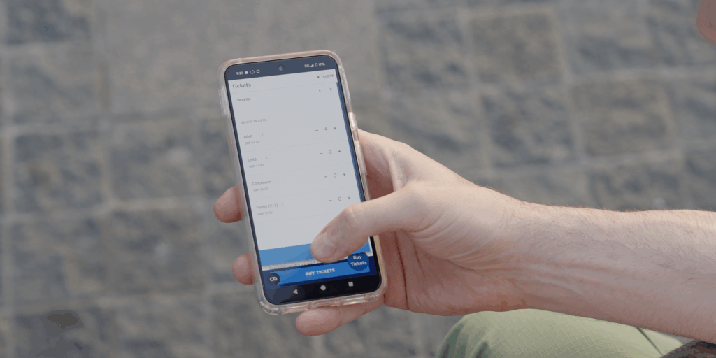
Below are four solid examples, written as ads your operators would actually run to sell tickets. Each one includes:
- The trust problem the guest is trying to solve
- The promise the ad must make (so the booking flow doesn’t get punished)
- Example ad copy options
- What the landing or booking page should match
Hop-on, hop-off: “I don’t want to waste half my day figuring this out”
Hop-on, hop-off is one of tourism’s most vibrant type of operators, and they have pretty clear desires: More bookings. Capturing customers as a sightseeing bus operator is all about getting into your audience’s mindset.
They’re thinking: “Is this legit?”, “Will I be able to find a stop?”, “How often does it come?”, “Will this be chaos?”
Set expectations about simplicity and control.
- How it works in one sentence
- What’s included (routes, audio guide, flexible start)
- What they need to do next (choose pass length, start at any stop)
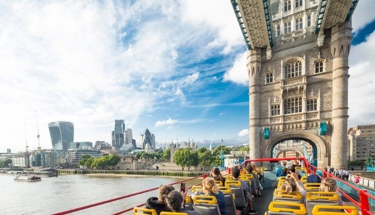
Example ad copy
Option 1 (Clarity-led)
“See the city your way. Hop on and off all day, start at any stop, and follow the route in real time. Choose 24h or 48h, and you’re sorted.”
Option 2 (Painpoint-led)
“Short on time? Do the highlights without planning a perfect route. Buses every X minutes on the main loop, with audio guide in multiple languages.”
Option 3 (Reassurance-led)
“No printing. No guesswork. Mobile tickets are accepted, and stops are mapped clearly. Pick your pass and start when you’re ready.”
What the booking page must match
If the ad says “easy”, the page must feel easy in the first 5 seconds:
- “Start at any stop” visible near the button
- Frequency and route clarity are visible before the price feels scary
- Ticket types are limited and clearly explained (24h vs 48h in plain language)
Ferries: “I don’t want to miss it and lose my money”
Ferries provide a uniquely beautiful way to explore and travel. However there are unique anxieties and questions that customers may have, especially when they are unfamiliar with using ferries.
They’re thinking: “What if we’re late?”, “What if the weather changes?”, “Will I be stuck arguing for a refund?”
Make the rules feel fair and calm.
- Flexibility explained simply
- What happens if plans change
- Clear next step (pick crossing time, choose standard or flexible)
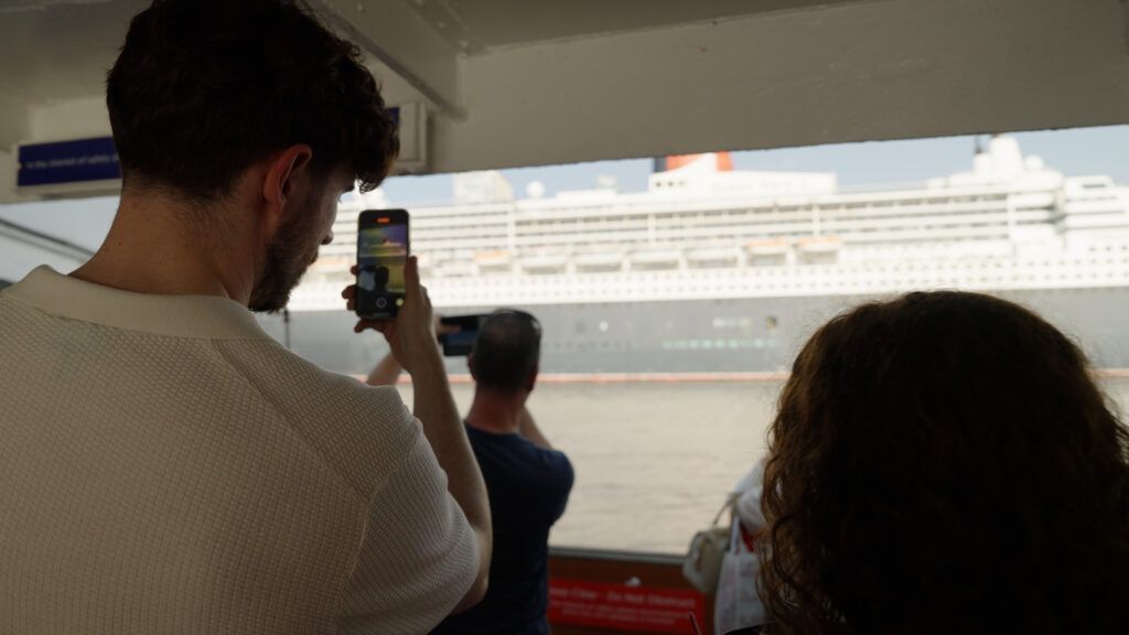
Example ad copy
Option 1 (Flexibility-led)
“Plans change. That’s normal. Choose a standard ticket or upgrade to a flexible return if you want extra breathing room.”
Option 2 (Family-led)
“Family day out made simple. Book your sailing in minutes, keep tickets on your phone, and know exactly what happens if you’re running late.”
Option 3 (Confidence-led)
“Clear rules, fair policies, and quick boarding. Pick your time, choose your ticket type, and you’re ready.”
What the booking page must match
- A short “If you’re late” and “Changes” line near the time selection
- Ticket types explained as outcomes (standard vs flexible)
No surprises at checkout (fees and terms should not appear at the end like a trap)
Tours and activities: “I don’t want to get the meeting point wrong”
Even the highest quality tours and activities operators need a little bit of a boost in their messaging. Anticipating travellers needs, fears, wants, and desires is crucial to maximising your bookings.
They’re thinking: “Will I find the guide?”, “Will I be the person who turns up to the wrong place?”, “Is this worth the stress?”
Sell confidence, not just the itinerary.
- Meeting point clarity
- What they get and how long it takes
- What happens after booking (voucher, map pin, instructions)
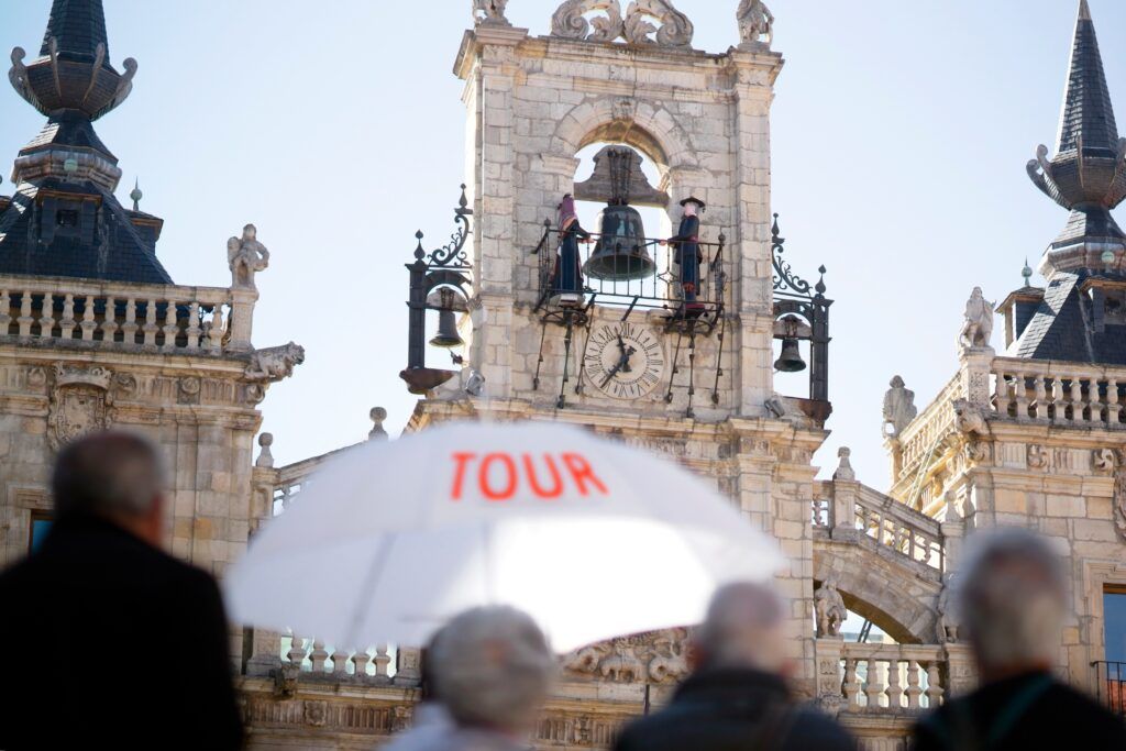
Example ad copy
Option 1 (Meeting point-led)
“Meeting point made simple. Book in minutes and get a clear map pin, landmark photo, and step-by-step directions straight to your phone.”
Option 2 (Time-led)
“Only got two hours? This is the tour that fits. Small group, clear meeting point, and a route designed for first-time visitors.”
Option 3 (Safety-led)
“Free cancellation up to X hours. Clear joining instructions. A tour that feels easy from booking to goodbye.”
What the booking page must match
- Meeting point preview before payment (even a short line and a mini map helps)
- A plain “what happens next” section: “You’ll receive your ticket and meeting point details instantly”
- Cancellation and reschedule rules visible early, not buried
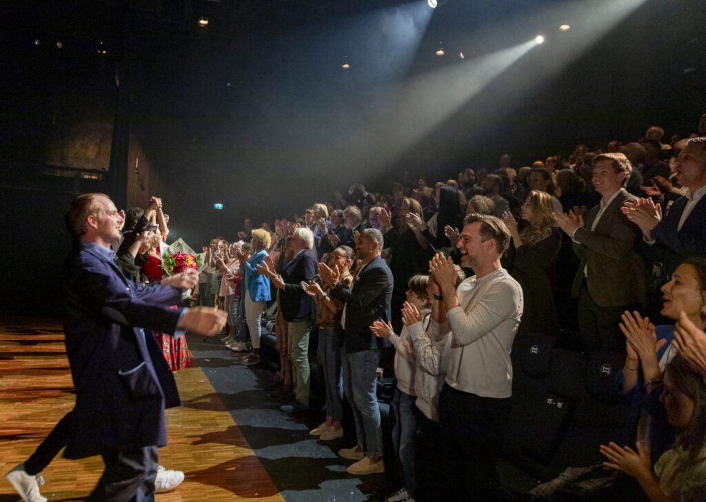
Seated shows and tourist concerts: “I don’t want bad seats or a nasty surprise”
Seating is always tricky, we all know it. If you are paying to go, you want to know what the best seats are for you. It creates anxiety, which is something you need to alleviate.
They’re thinking: “Will I be able to see?”, “What does this category actually mean?”, “Will I regret not paying more?”
Reduce seat anxiety.
- Simple seat categories explained
- What’s included (timing, entry process)
- A clear upgrade path without pressure
Example ad copy
Option 1 (Seat confidence-led)
“Choose your seat category with confidence. Clear view options, simple explanations, and mobile tickets for easy entry.”
Option 2 (Value-led)
“Best value seats for a brilliant night. See what each category means before you book, so there are no surprises at the door.”
Option 3 (Experience-led)
“Make it a proper night out. Great music, easy entry, and clear seating options. Pick your category, and you’re done.”
What the booking page must match
- A visual or plain explanation of categories before selection
- “What you can expect” in one short block (duration, arrival time, entry process)
- Avoid vague labels like “Category B” with no meaning
A simple template operators can reuse for any guest-facing ad
If you want operators to apply this fast, give them a repeatable structure:
- Name the worry (missing it, getting lost, wasting time, bad seats)
- Give the reassurance (clear meeting point, flexible options, straightforward tickets)
- Set the next step (choose date, pick ticket type, get instant confirmation)
Example template
“Worried about [common fear]? We make it simple with [reassurance]. Book in minutes and [what happens next].”
Quick rule of thumb, so this stays consistent
- If your ad promises “easy”, your booking flow must be short and obvious
- If your ad promises “flexible”, your rules must be visible early
- If your ad promises “clear meeting point”, show it before checkout
- If your ad promises “good seats”, explain categories like a human
Closing thought
If you want better leads, stop treating the form as a persuasion tool. Your ad sets the emotional tone. Your ad answers the unspoken questions. Your ad earns the click. Lead quality is not created at submission. It is decided before they ever open your form.
If you want to know more about how to maximise success with leads, connect with Palisis and bring our expertise into the equation.