The 12-hour ticket used to be the quiet option on the menu. The one you’d only notice if you were really, really committed to reading every line.
Now it’s having a moment.
Arival’s Tour Taker research found that 69% of travellers chose tours lasting three hours or less in 2024, which tells you where the wider market is heading: people want experiences that fit neatly into their day, without a big commitment.
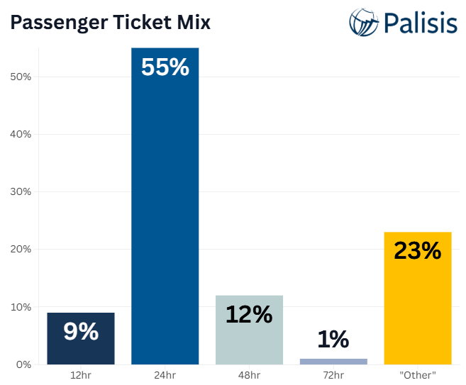
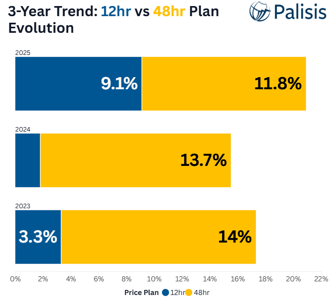
That lines up nicely with what we’re seeing in HOHO. In our 2025 state of HOHO data (download your copy here), 12-hour tickets make up 9.1% of the plan mix, and the pricing is interesting, too: the median 12-hour price is €31.47, compared with €26.02 for 24-hour tickets. The 12-hour ticket is not “the cheaper one”. It’s the “this fits my day” one.
The only catch is this: if you don’t position it properly, it becomes the ticket people argue about at the stop – and a queue is the main thing that slows down your day.
This article is about how to price, name, and present it so customers get it instantly.
Related reading: If you like the “shorter experiences are rising” trend, we recommend:
(And yes, the logic is similar: shorter does not always mean cheaper if it better matches what someone is trying to do with their day.)
Why the 12-hour ticket is working right now
A lot of HOHO customers are not planning a perfect itinerary. They’re doing something more realistic:
- They arrive late morning.
- They want the main highlights.
- They want flexibility, but not a multi-day commitment.
- They want to feel like they’re making a “smart choice”, not a rushed one.
The 12-hour ticket is basically the “today ticket”. It fits the tourist brain on the day, especially if someone is shopping around that late-morning rush.
The three reasons 12-hour pricing gets messy
1) People assume shorter means cheaper
Even when it’s not true.
If a 12-hour ticket is priced near, equal to, or above a 24-hour ticket, customers will only accept it if you clearly explain why it exists.
2) “12 hours” sounds like a maths test
Is it 12 hours from purchase? From the first scan? Does it run out at the end of the day? If it’s not obvious, you’ll get friction.
3) It gets compared to 24-hours in the worst moment
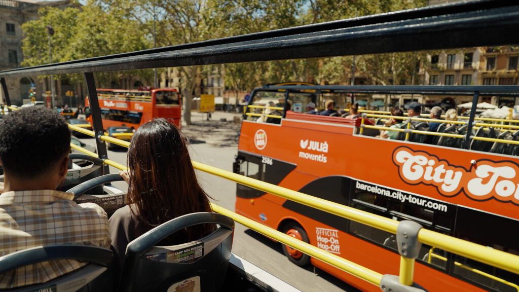
At the stop. In a queue. With someone asking, “What’s the difference?” while five people behind them sigh dramatically.
Part of the difficulty of any tour business is in translating the exact benefits and limitations of a ticket to the customer – or customers for groups, which introduces a host of other challenges.
So your job is to make the 12-hour option feel like a confident choice, not a confusing one.
How to price the 12-hour ticket without annoying people
Price it based on use case, not duration
A good mental model is:
- 24-hour is the flexible default
- 12-hour is the “fits my day” option
That means you can price 12-hours higher than you might expect, but only if you make the value obvious.
Practical positioning examples:
- “Arriving late? 12-hour is built for the rest of your day.”
- “Doing the highlights in one go? This is the simplest option.”
Keep the price gap logical
You want the customer to feel like they’re choosing what fits, not being punished for picking the shorter ticket.
If the 12-hour ticket is close to 24-hour, that can be fine, but the difference needs to feel intentional:
- 12-hour = convenience and simplicity for a single day
- 24-hour = flexibility across a longer window
If you cannot explain it in one sentence, the guest will assume it’s a mistake.

If you do one thing, do this
Decide what behaviour you want the 12-hour ticket to drive, and price for that.
Common good reasons to push 12-hour:
- You want a strong “same-day” product that reduces indecision
- You want a premium single-day option without discounting 24-hour
- You want to simplify the menu for walk-up buyers
Naming and wording that stops confusion
This is where most operators lose money, time, or both.
Use a name that explains the scenario
Try:
- 12-hour ticket (best for one-day visits)
- 12-hour ticket (ideal if you arrive late)
Avoid vague names like “Half-day pass” unless you define what half-day means.
Say exactly when the clock starts
Pick one rule and make it visible everywhere the ticket is sold.
For example:
- “Valid for 12 hours from first scan.”
Then repeat it:
- On the ticket selection screen
- On the confirmation message
- On the ticket itself, if possible
The goal is for staff not to have to explain it 200 times a week.
How to present the 12-hour ticket on your sales screens
Your screen order matters more than most people think.
For stop sales and walk-up
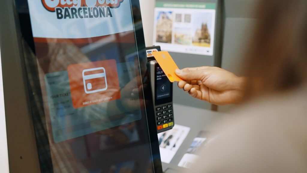
Put the 12-hour ticket first if it’s genuinely a popular “today” option, but label it clearly.
Example layout:
- “Here today? 12-hour ticket”
- “Want more flexibility? 24-hour ticket”
- “Here for longer? 48-hour, 72-hour”
This reduces hesitation and speeds up the queue.
For online
Default to 24-hour, but show 12-hour as a smart alternative for late starters.
Example copy:
“Arriving after lunch? 12-hour is often the best fit.”
How to avoid the classic stop argument
You know the one. Someone points at the 12-hour and says, “So this is cheaper then?”
Here’s the simplest staff script that works:
“12-hour is the best fit if you’re doing everything today. 24-hour is better if you want flexibility across tomorrow as well.”
Short. Calm. No pricing debate.
If you want to add a tiny bit of personality, keep it friendly:
“12-hour is the ‘today ticket’. 24-hour is the ‘sleep on it and keep going’ ticket.”
Quick checklist: Is your 12-hour ticket helping or confusing people?
- Is the ticket name self-explanatory?
- Is the start time rule visible at the moment of buying?
- Could a customer explain the difference between 12-hour and 24-hour in one sentence?
- Do your staff have a short script that avoids debates?
- Is your menu ordered by customer intent, not by how long the list has existed?
If you answered “no” to two or more, you’re not far off fixing it. You just need to make the choice feel obvious.
Connect with more customers through countless distribution channels by partnering with Palisis!