Every year, Palisis publishes its state of hop-on hop-off bus tours report to help operators understand how traveller behaviour is changing across the sector.
The reports are based on anonymised booking, ticketing, sales and validation data processed through Palisis software. Instead of relying on surveys or general travel sentiment, we look at what happened across real HOHO operations.
That includes how travellers booked, when they travelled, which ticket types they chose, how far in advance they planned, how often tickets were scanned, and where patterns differed by region.
The goal is simple: to give HOHO operators useful benchmarks they can compare against their own business.
What data is included?
Each report uses anonymised and aggregated data from hop-on hop-off operators using Palisis.
The sample size changes each year, depending on the reporting period and the operators included in the dataset.
The reports currently cover:
- 2023: 2.7 million bookings and 5.66 million tickets processed through Palisis
- 2024: 2.8 million bookings and 5.9 million tickets processed through Palisis
- 2025: 2.8 million bookings and 5.5 million tickets processed through Palisis
The 2024 report also included an early 2025 trends section, based on January to May 2025 data. This covered 940,000 bookings and 1.85 million tickets, giving operators an early view of how traveller behaviour was shifting before the full 2025 report was available.
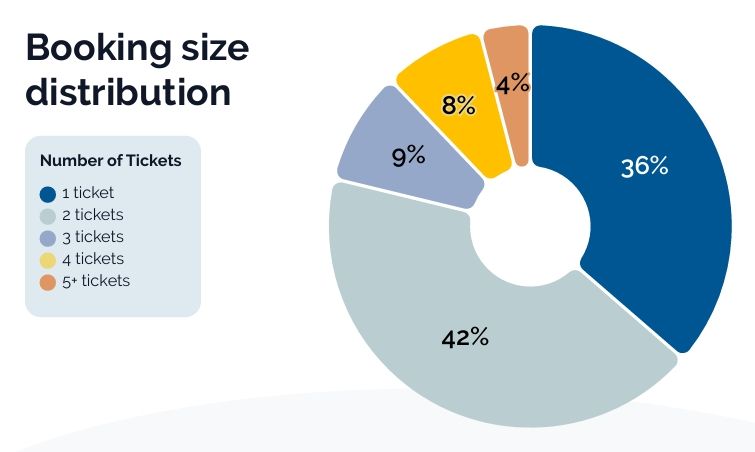
Across the reports, we look at areas such as booking volume, ticket volume, booking size, sales channel, ticket type, passenger category, pricing, discounts, refunds, unused tickets, lead time, scan activity and regional patterns.
Why we use operational data
Many travel reports are built around surveys, forecasts or broad tourism trends. These can be useful, but they do not always show what is happening on the ground.
HOHO operators need to know when guests actually arrive, which tickets they buy, how quickly they board after booking, which channels create the most refunds, and where operational pressure builds during the day.
That is why these reports focus on transactional and operational data. They are designed to help operators make practical decisions about pricing, staffing, distribution, product mix and the guest journey.
How the reports are structured
To make the data easier to use, each report is grouped into practical sections.
These usually include:
- Traveller profiles, such as group size and passenger type
- Booking behaviour, such as sales channel, booking time and day of week
- Pricing and revenue, such as ticket price, discounting and price plan mix
- Ticket lifecycle, including refunds and unused tickets
- Hopping behaviour, including lead time, scan activity and ride patterns
- Regional comparisons, where there is enough data to show meaningful differences
- Year-on-year trends, where comparable data is available
The aim is not just to show the numbers, but to explain what they might mean for day-to-day HOHO operations.
How we define booking channels
Sales channels are grouped according to how the booking was made.
Across the reports, the main channel categories are:
- Onsite: Tickets sold at the stop, terminal, ticket office, kiosk or through sales hardware
- API: Tickets sold through a third-party system using an API, including OTAs and reseller platforms
- Online: Tickets sold through the operator’s own website, webshop or direct online booking engine
- Box office or back office: Tickets sold through an internal browser-based tool, call centre, concierge or operational sales process
In some sections, the reports also compare direct and indirect sales. Direct sales are bookings made through the operator’s own channels. Indirect sales are bookings made through partners, agencies, suppliers or third-party systems.
How ticket types and passenger types are grouped
Ticket types are grouped into broad price plan categories where possible, such as 12-hour, 24-hour, 48-hour, 72-hour and “other” tickets.
The “other” category may include tickets with shorter or less standard validity periods, special event products, commuter tickets, evening-only tickets, bundled products or tickets where the timeframe could not be clearly grouped.
Passenger categories are based on the ticket types configured by each operator. Where possible, tickets are grouped into clear categories such as adult, child or family. Some operators also use local, group, concession, student, senior or discounted ticket types. When a passenger category cannot be confidently assigned, it may be grouped into a wider or niche category.
This approach lets us show broad traveller patterns without forcing every operator’s product setup into the same model.
How pricing is handled
Pricing data is standardised where needed so it can be compared across markets.
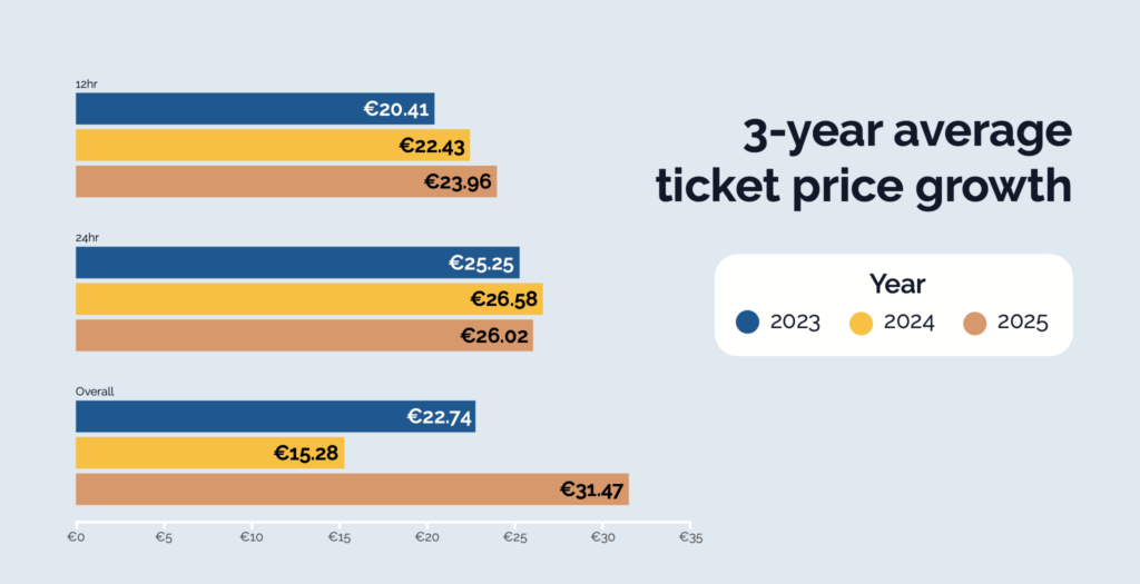
Where reports include pricing in EUR, prices are converted using the average USD to EUR conversion rate stated in that year’s report. The 2023 report used 1 USD = 0.9242 EUR, the 2024 report used 1 USD = 0.9243 EUR, and the 2025 report used 1 USD = 0.886 EUR.
Because operators use different pricing structures, the reports may refer to median price, average price, price by ticket type or price by passenger type, depending on what best represents the trend being discussed.
Where discounts are shown, they only include discounts that were recorded in the billing process. Some operators apply discounts directly within the original ticket price, so those discounts may not appear separately in the data.
How booking time, lead time and scan activity are measured
Booking time refers to when the ticket was purchased.
Where times are shown, they are based on the operator’s local time, not necessarily the traveller’s home time zone. This matters for online bookings, where a tourist may book before arriving in the destination.
Lead time measures the gap between when a ticket is booked and when it is first used. This helps show whether travellers are planning ahead or making decisions while already in the city.
Scan activity shows when a ticket was validated or used. This helps operators understand when passengers are actually boarding, which can be different from when they buy.
Together, these signals help operators spot peak pressure points, such as busy onsite sales periods, boarding peaks and changes in same-day booking behaviour.
How refunds and unused tickets are measured
Refund data is based on tickets that were refunded through the system.
Unused ticket data is based on tickets sold but not scanned or validated.
Both figures are useful, but they show different things. Refunds show revenue that was reversed. Unused tickets show purchases that did not turn into a recorded ride.
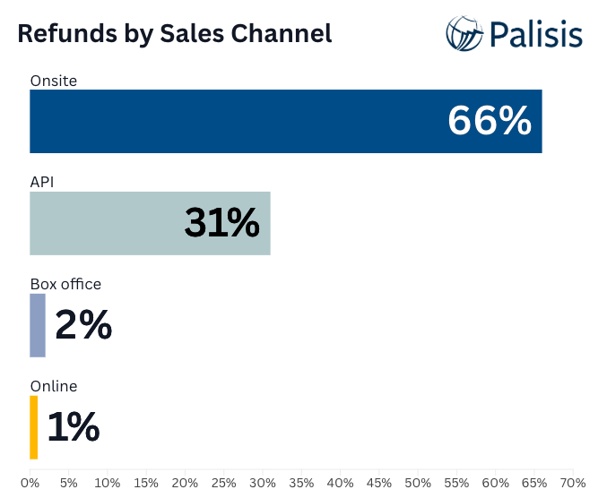
The reports may also compare refund behaviour by channel, passenger category or month, helping operators understand where revenue is most at risk.
How regional and year-on-year comparisons are used
Regional comparisons are included where there is enough data to show meaningful differences.
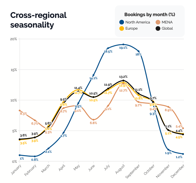
The reports currently include regional deep dives for markets such as North America, Europe and MENA. These comparisons are not designed to rank regions against each other. They are there to show how traveller behaviour changes by market, from booking windows and price sensitivity to seasonality and ticket mix.
Where comparable data is available, the reports also show how behaviour has changed over time. This may include changes in average booking size, solo traveller share, same-day booking behaviour, sales channel mix, ticket prices, discounts, refund behaviour and price plan usage.
Year-on-year comparisons should be read with care. Changes may reflect traveller behaviour, operator mix, regional performance, product setup, pricing strategy, seasonality or wider market conditions.
What the reports can and cannot show
The Palisis state of HOHO reports are based on real booking and ticketing data, which makes them useful for identifying operational trends.
However, the reports reflect activity processed through Palisis software. They do not represent every HOHO operator in the world and should not be treated as a full global census of the sector.
They also show what happened, not always why it happened. For example, a rise in same-day bookings may reflect traveller spontaneity, weather, mobile booking behaviour, changes in OTA traffic, local events or operator-specific sales strategies.
For that reason, the reports should be used as benchmarks and discussion points, not as one-size-fits-all rules.
How operators should use the reports
The best way to use the reports is to compare the sector-level patterns with your own business data.
For example, operators can ask:
- Are our busiest booking hours similar to the wider HOHO pattern?
- Do we rely more heavily on onsite, online or API sales?
- Are our refund rates higher or lower than the benchmark?
- Are travellers booking further ahead, or more last-minute?
- Which ticket types are growing?
- Are our staffing plans aligned with when people actually board?
- Are we using our own data to shape pricing, promotions and route planning?
The reports are most valuable when they help operators look at their own numbers with fresh questions.
Why Palisis publishes this data
Palisis works with HOHO operators around the world, giving us a unique view of how the sector is changing.
By publishing these reports, we want to help operators make more informed decisions, especially as traveller behaviour becomes more spontaneous, more digital and more fragmented across sales channels.
The state of HOHO reports are not just a look back at the previous year. They are designed to help operators prepare for the next season with clearer data, better benchmarks and more confidence in the decisions they make.